

Just looking for the theme? Get it from the Chrome Web Store or grab the source from Github.
I don’t know exactly what came over me. I’m not much of a theme-sorta-person outside the casual “oh good, I can read that code” kind of result.
On the other hand, I can’t stand the single sliver of a line that most consoles have as their default cursor. Maybe my eyesight is going or I just feel nostalgic, but I require that block. My dotfiles have such a theme for zsh shell, my chosen theme for Visual Studio Code is one of the few with a block cursor.
Chrome’s DevTools has been a notable holdout. I spend a lot of time in DevTools and the small sliver of a console cursor, particually on my not-so-scaled screens was a mystery to find some times.
How does one change it I thought to myself. I set out to figure it out.
Hacking on DevTools
Fiddling with DevTools is actually one of the easier things you can do. Want to try it out? Open up DevTools, then inspect DevTools itself. Go ahead, I’ll wait.
Ah, you’ve returned. Pretty cool uh? You can inspect and see how things are made with the ease of any other web page you’ve used Chrome DevTools with.
Where does the cursor come into play? Turns out, there’s a CSS class called
.CodeMirror-cursor that’s ripe for some updates:
With a quick change, we end up with a block cursor that looks okay, as seen in the sample video below:
Success is good. But how do actually make that stick in DevTools? For that, we need a theme.
Standing on the shoulders of theme giants
Since I am not one for reinventing the wheel, I asked around to see who had the de-facto theme solution for Chrome DevTools. I didn’t have to look far.
For starters, the Chrome Team had an open ticket detailing the changes required with the removal of the old /deep/ and ::shadow for styling DevTools, which means that a lot of material out there previous to this change earlier this year was likely to not work.
Luckily the excellent Maurice Cruz' zero-base-themes setup was patched with initial support. With a little bit of effort, I soon had said small CSS revision working without issue.
The key thing here was that you do have to enable a few flags in Chrome to make this all work.
- Go to chrome://flags/#enable-devtools-experiments
- Locate and enable “Enable Developer Tools experiments”.
- Select “Relaunch Now” at the bottom of the page (WARNING: this will restart Chrome).
- Open DevTools > Settings
- Select Experiments tab, and check ‘Allow custom UI themes’.
- Select Preferences tab, and select Theme: Dark (this theme stacks well with dark).
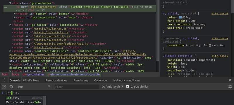
At that point however, I asked myself the age old question: that was a lot of boxes to turn on, should I give this theme some kick? With great flexibility comes the ability to add more.
Given my current VS Code theme, I said why not match? I set forth with relative ease to do nothing more than port the excellent Marvin R' vscode-theme-dark-atom-dark-green-cursor theme to DevTools.
The end result? Pretty colors and a block cursor:
You can too!
After testing the waters in March to see if anyone would want such a feature, a few people chimed in with yes. Which means you can now get said plugin from the Chrome Web Store or you can grab the sourcecode from Github.
Do read the instructions and as things change in Chrome DevTools I suspect I’ll have some patches to make. Find an issue, report the bugs on the repo above.
Otherwise…go hack on DevTools. You know you want to.