

Ever since I ghosted the larger swarm of socials, Mastodon has become my go to collect off the cuff thoughts and share things. I setup my own instance which I found to be a rewarding experience, and I’ve just been rambling about to no particular end.
One thing that has been missing though that has bothered me about Mastodon: no one ever has a share button for it on their website. Sure, the Web Share Target API works great with the PWA version on my phone, but my phone is better used a cup coaster at this point and I’d like some of that sweet sharing action on my Chromebook or desktop.
Where do you get off Justin, you don’t even have a Mastodon share link on your posts! Indeed angry internet user, I didn’t. My reasons were the same as everyone elses I suspect: the decentralized nature of the platform makes any one target hard to deal with. You don’t know (and honestly, I should not need to know) where your instance is.
To remedy this, I’ve come up with a tiny web component called <share-to-mastodon> which does as much of the heavy lifting as possible. Under the hood:
- On interaction, opens a little modal dialog window asking for the instance url
- Allows user to select from a default datalist that is present or custom set by the site (the power of
input type=url listanddatalist! yeah web platform) - Will remember that domain in localStorage if the user wants
- Does zero tracking of anything
- Lots of custom css props, every string can be overridden for all your locale needs
You can see this inaction in the little demo video I made or you can just scroll down to the bottom of this post and click the Mastodon link in the share section (unless of course you are on mobile…as I only load it if your device/platform doesn’t support the Web Share API).
To use, you can install it via npm or yarn:
You can also just include the built dist version (which includes LitElement)
There are lots of available options (do check out the docs or the repo), but the general gist is it’s pretty simple to use:
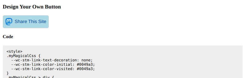
For a more complex, “I really want a button” look, the lightDOM can be styled in conjunction with the many available css custom property options.
Now I readily admit there is a bit of a trick this. One, the component is by default an display: inline (as all web components are unless you override the :host) and the magically the contained modal and backdrop load. How exactly is that? Quick eyed readers will not that the actual slotted lightdom or string temporarily hide and internals of the web component change, giving you the effect of the modal without additional setup. This has some disadvantages but from a I-am-contained standpoint, it’s a little easier to handle.
For now, it fits my initial needs, at least during this first release. Stay tuned, as we’re going to dial this component’s use up a bit in the coming days.